
As it turns out, Vogue isn’t so so vogue after all. When the 2010 covers were layered together, the product revealed the magazine’s very strict format. However, if you juxtapose the layered editions from various countries, many cultural patterns are revealed.
Even if Vogue’s structured approach is fairly disappointing, I have to admit it- the end result is pretty beautiful.
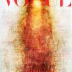
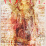
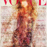
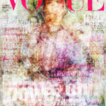
For the most part, most country’s editions followed a strict formula when it came to the cover’s design (surprise, surprise). When every 2010 cover across all Vogue editions was layered together (minus the text), this was the end result:

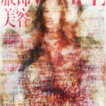
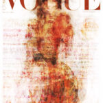
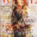
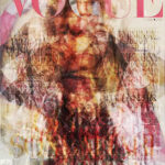
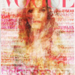
The American, British, Chinese, Indian, Australian, Mexican, and Japanese versions all put an emphasis on the model’s face. Take a look at the UK version:

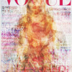
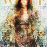
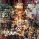
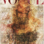
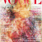
In Australian editions, the G in Vogue tended to frame the model’s face:

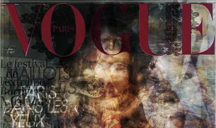
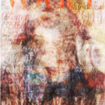
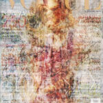
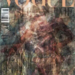
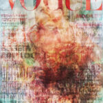
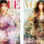
However, the Paris (left) and Italy (right) editions did not follow these formulas. Their covers tended to be blends of dark, rich colors and when layered together, revealed an independent and somewhat avant-garde nature from the structured layout typical of the rest of the world’s covers.
 |
 |
We might be able to go as far as to say that mainstream fashion and design is limited by the region’s comfort level. While there tended to be flares of each region/country’s identity, with the exception of Paris and Italy all of the editions followed nearly identical design structures.
What types of trends do you see?
Layered 2010 Vogue Covers by Country


Thank you to Long Live McQueen for layering these issues and posting them online.
Leave a Reply to Olivia Cancel reply